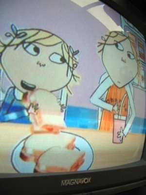
 Here in Parentville, "Charlie and Lola" is one of our favorite animated shows. Favourite family programmes, I suppose I should say, since it comes from England and, unfortunately, only lasts 15 minutes at a time, rather than the standard 30.
 It's the charming story of an older brother and younger sister and the fun adventures they find themselves in, all rendered in a simple yet whimsical line-drawing style and filled in with broad markers and scraps of fabric/paper that look like something unearthed from your grandmother's attic. (It always reminds me of what poet Stevie Smith's drawings would look like if they came to life and weren't so suicidal and depressive.)
 John especially loves the program because I think it reminds him of what Finn and Shea will (hopefully) be like in a few years. He loves it so much, in fact, that he's been in a funk since the PBS syndicate here in Southern California changed its regular air time a couple weeks ago and he's now unable to watch it with Shea during their early morning father-and-daughter bonding session before work each day. "Bear in the Big Blue House totally sucks," he recently vented, in response to the show that took C&L's former slot. Priorities, people; we've certainly got 'em.
 As siblings, Charlie and Lola occasionally spat, of course, but it's always in a kind, respectful, very British and articulate kind of way. Charlie, the infinitely patient older brother, is continually charmed by his silly and funny little sister, while Lola, the feisty sparkplug of a little sister, adores her older brother and wants to be part of everything he does. Idyllic? Yes. Realistic? Probably not. Heartwarming nevertheless? You betcha.
In the morass of insipid children's programming and uninspired, flat animation, C&L is a viewing highlight. Its visuals are dear without being saccharine, its music playful without delving into Muzak, and its message sweet without being preachy. Well done, Charlie and Lola. May our children one day love you as much as their parents do.


1 comment:
K - can I make a suggestion? Could the blue hyperlinks be lightened a bit so the text contrasts a bit more against the background? It's sometime a wee bit rough to make out the blue as it is now. Just my humble request for today. More greetings from Ottawa, eh?
Post a Comment